SUNDAYS.COM
ROLE
UX/UI Design
PRODUCT
The initial concept for the app was a second-hand clothing but there was no appetite in the user research for this product, so the concept was amended based on what users were saying they wanted, which was a
curated collection of clothing with exceptional quality, unique basics.
DISCOVERY
To understand what was required for the MVP, the competitor landscape was reviewed, the clients vision was explored, and research into user needs, behaviours and pain‐points was undertaken. The research revealed 2 key segments: women looking for clothing that was unique and of good quality and women looking for quality basics with a great fit.
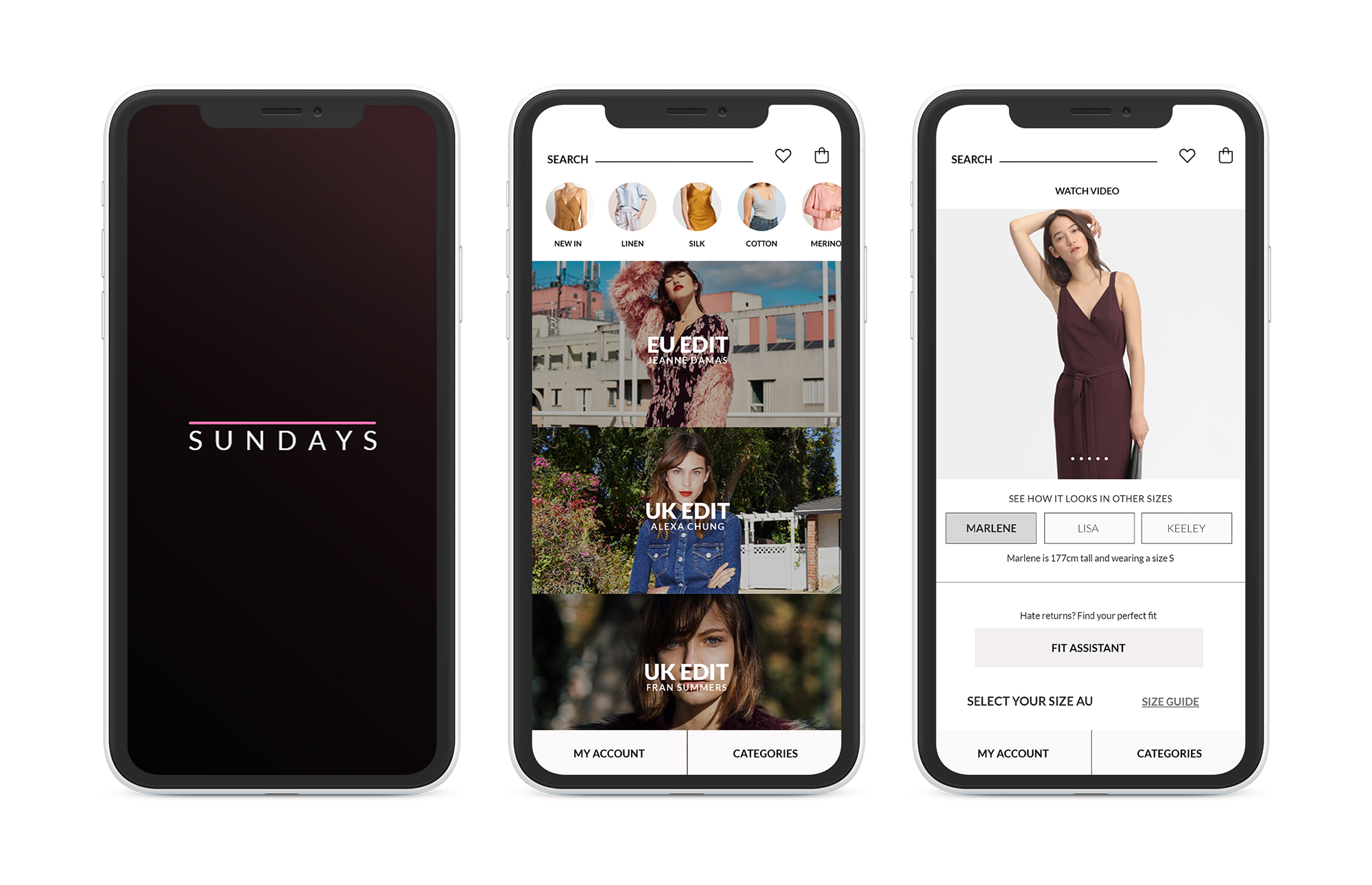
This research was then used to create customer journey maps that gave additional insight into pain points. The most opportunities were found at the consideration stage. Shoppers were annoyed that they couldn’t work out their size easily and were anxious about choosing the wrong size and returns being costly and time consuming. To address the pain points identified during interviews and customer journeys, the site would feature a minimalist, curated shopping experience. It would include an upfront fit assistant so that people could find their size and fit before starting to shop with the ability to view multiple sized models and videos on the product page. It would feature one-click, free returns with minimal paperwork. Packaging will be minimal and plastic free and users will see an expected lifespan for their clothing.


SOME ASSUMPTIONS THAT WERE PROVEN WRONG:
1) People just want a really quick delivery these days, same day for sure.
Wrong. People are happy to wait as long as they know how long it will be, especially for international deliveries.
2) People are shopping seasonally. Wrong. People are buying items of clothes when they need them, independant of season.
3) People return everything if it doesn’t fit. Wrong. 50% said they usually just can’t be bothered and give clothes to their friends especially if they have to pay for shipping.
4) People care a lot about sustainability at the moment. Not really. 7 out of 10 said they care but it’s not the motivator for their purchases and this is not reflected in where they shop.
5) People love Afterpay, it’s the future of online payment. Wrong. 9 out fo 10 people said they think it’s actually a bad idea and encourages debt. (Most people payed off their credit card every month).
DIRECTION
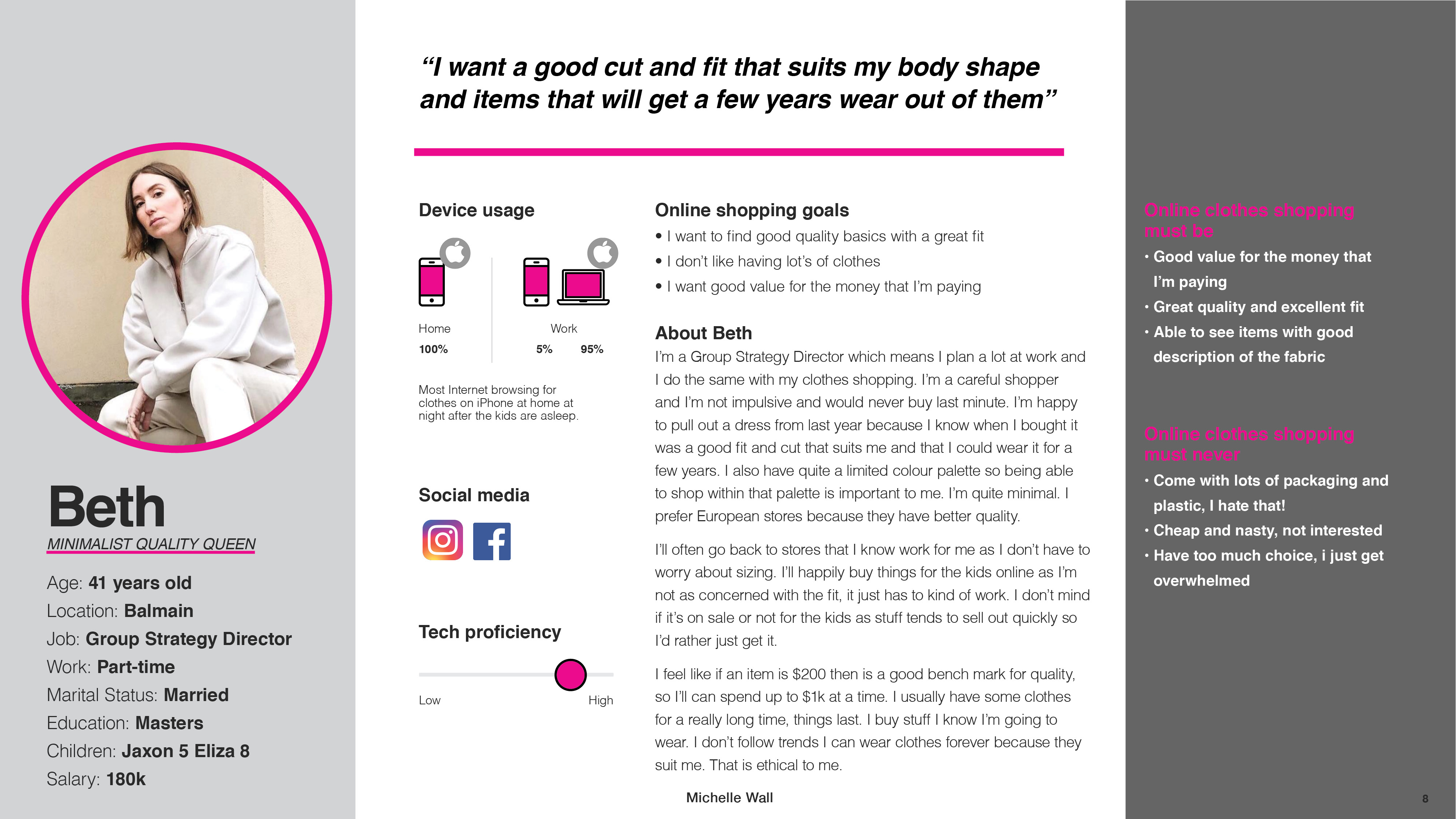
The 3 personas guided the design direction for the site. The structure of the site was developed by sketching and storyboarding, with multiple options for the user interface and interactivity of the experience explored.
PROTOTYPE
The 3 personas guided the design direction for the site. The structure of the site was developed by sketching and storyboarding, with multiple options for the user interface and interactivity of the experience explored.
PROTOTYPE
TESTING

REFINEMENT:
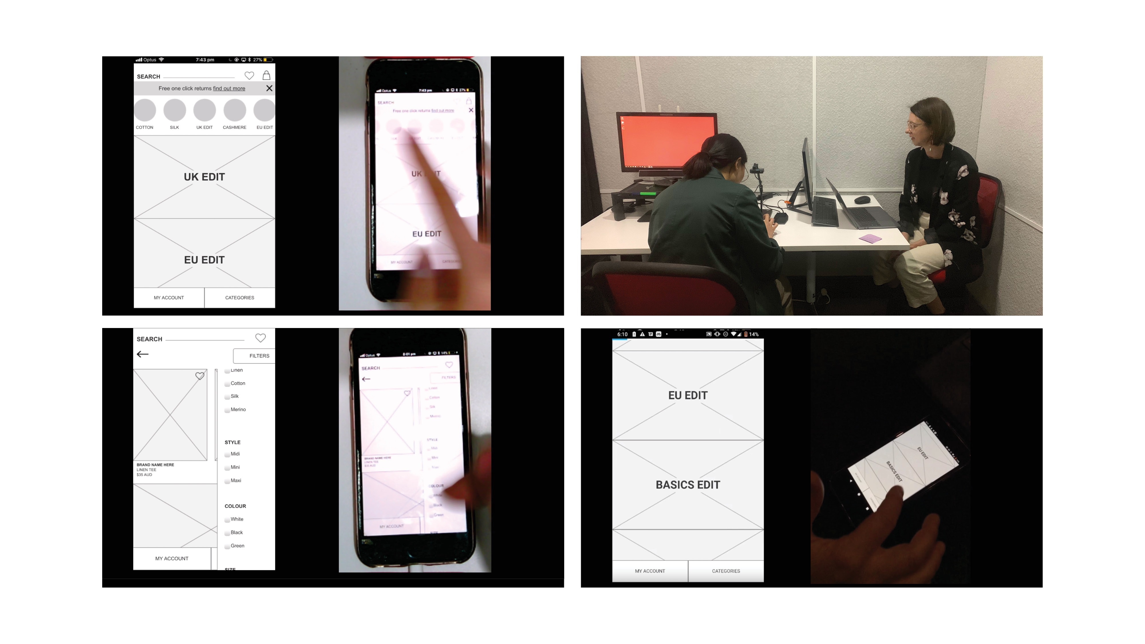
User testing was undertaken with participants that matched the personas. The first iteration of the prototype was tested with recommendations to test again after revisions were made.
NAVIGATION:
Half of all users had difficulty finding the login button. It is recommended to increase the size of the button. It is recommended to change “My Account” to “Login/Register” when the user isn’t logged in.
RETURNS:
It is recommended to allow users to click through from the homepage banner to their account and to include more detailed instructions on how to locate “returns”.
FILTER:
It is recommended to include a button to apply the filters as 3 out of 4 users wanted to apply their selection.
CHECKOUT AS GUEST:
All users commented that they didn’t want to have to create a password. 1 user didn’t like having to enter their DOB. It is recommended to remove the necessity to create a password.
FIT ASSISTANT:
It is recommended to include access to the Fit Assistant in “My Account” not logged in, so that users can access it easily without logging in to increase the uptake of this section of the app.
